02/2022
Sepur
Rebranding
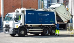
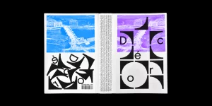
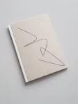
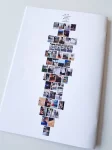
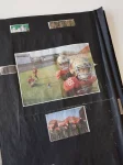
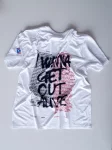
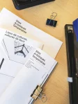
A major player in waste management, Sepur needed its image to reassert its mission: valuing people and places for a more sustainable future. The logotype was redrawn, and the existing brand codes reworked around a new typographic direction. A line runs through the identity to connect, reveal and frame. The photography direction expands to include action close-ups and portraits. The whole system was also built to adapt and animate across various talks, interviews and shows produced for the brand. Made at types top.